NCS Colour AB
Corporate Identity
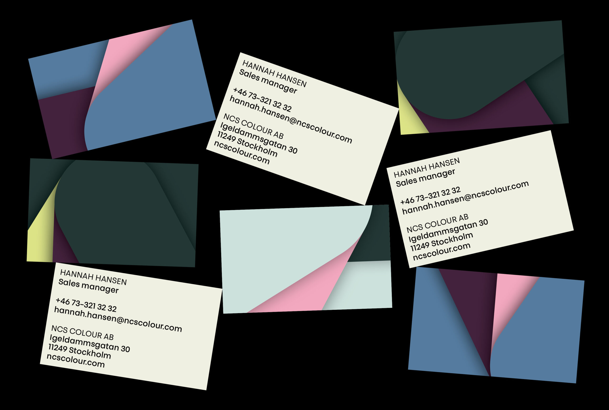
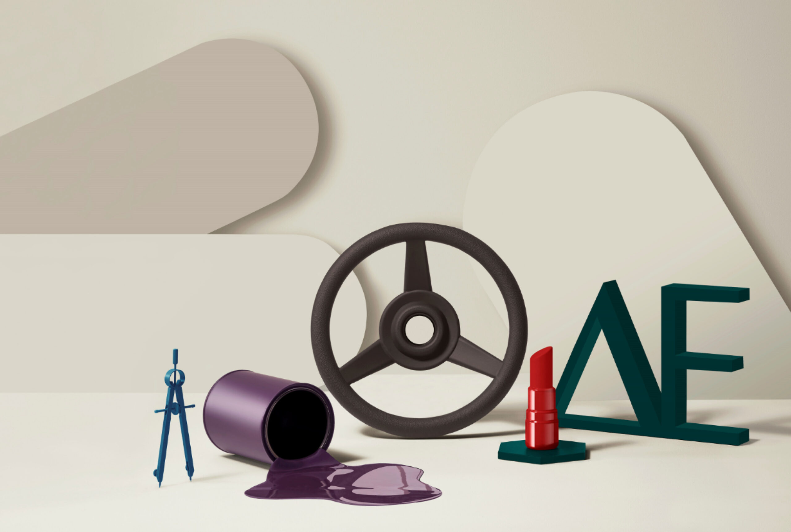
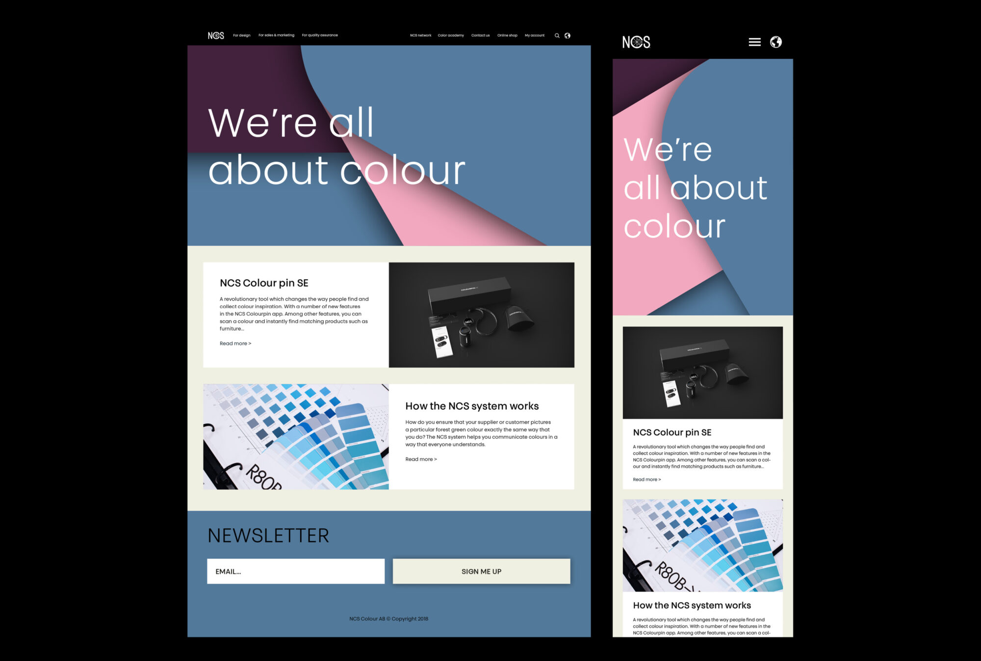
The re-branded identity for NCS Colour AB balances their iconic typographic heritage with a more contemporary feel by applying a geometric sans serif designed for both screen and print. The typeface is applied in all text-communication as well as in the logotypes where it is merged with the old word mark to give it a new typographic look. We introduced a bold and versatile colour palette using NCS’s own colours and methods of creating harmonious combinations to communicate their expertise. The palettes form a collection of 3D-graphics, portraying the process of choosing colour.
Assistance by Johanna Lundberg
Set design by Emelie Ekenborn
Photography by Emil Fagander